Help & how it works
A plain-language guide to what Snowdesk does and how to use each part of it.
Getting started
What is Snowdesk
Snowdesk brings together official avalanche bulletins from three providers — SLF (Switzerland), ALBINA (Austria/EUREGIO), and Météo-France — onto a single interactive map, with a consistent layout for every region and every day.
You don't need an account to browse: pick a region on the map, read today's danger rating and avalanche problems, or scrub back through the season to see how conditions have evolved. Signing in adds the things you save: pinned places and regions, uploaded routes, and map areas downloaded to read offline.
Bulletins
The day's danger rating
Every bulletin carries a danger rating on the five-level European scale — Low, Moderate, Considerable, High and Very High. The number and its colour are the headline: they say how likely avalanches are and how serious they would be, for the region as a whole.
The panel below the header breaks the day into windows. Most days have a single, unlabelled row: that rating holds all day and there is nothing more to say. When a provider expects conditions to change — a storm arriving, or the sun working on the snow — a second row appears with its own rating and a "Later" tag, as above. Only a window that departs from the baseline is tagged, so a tag on the panel always means the day is going somewhere.
Some providers split a window by height instead, giving one rating above a pivot elevation and another below it. Those rows carry a small mountain glyph shaded to show which half of the mountain they describe.
For a full walkthrough of the scale and its subdivisions, see the dedicated guide: How to read a bulletin.
Avalanche problems
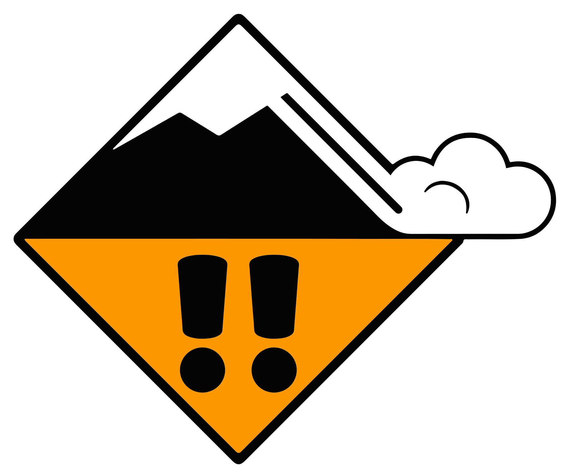
The danger rating says how dangerous the day is. The avalanche problems say why, and where. Each one is a card like the example above, and a bulletin usually carries one to three of them.
The icon and title name the problem — fresh wind slab, a persistent weak layer buried in the snowpack, wet snow, gliding snow, new snow or cornices. Each behaves differently and asks for a different response, which is why the bulletin names them rather than giving you a number alone.
Below the title, the compass rose and the elevation glyph say where the problem lives: which slope aspects it has formed on, and above or below which height. A problem on north-through-south-east aspects above 2200 metres is not a problem on a sunny south-west slope at the valley floor, and the card is telling you where to expect it.
The comment underneath is the forecaster's own words, shown as they wrote them. It is the part that says what will release the problem and how it will behave, and it is worth reading in full — Snowdesk never summarises it away.
For what each problem type means in the snowpack, and how to read the cards in detail, see: How to read a bulletin.
The season calendar
Every bulletin page has a "Season" button in its header, marked with the season's years. It opens a heatmap of the whole season for that region: one tile per day from the season's start through to tomorrow, laid out as weeks running down the columns.
Each tile carries that day's danger rating in its colour, so a season's worth of conditions reads at a glance — the settled spells, and the weeks that ran high. A day whose rating varied across the region is split diagonally between the lowest and the highest it reached.
Tap any day that has a bulletin to jump straight to it. Days with no bulletin — before the season began, or a gap in what the provider published — are drawn flat and do nothing.
The day's weather

Resort and saved-pin pages carry the day's weather: a condition icon and label, the high and low temperature, any new snow, the freezing level, wind, and when the sun rises and sets. It comes from Open-Meteo and describes one place. A bulletin covers a whole region rather than a place, so it carries no Open-Meteo reading — its weather is the forecaster's own description, further down the bulletin page under "Snowpack & Weather".
A resort page shows one block per place we hold for it — typically the village, a mid-mountain station and the top — each labelled with its height. That is the point of showing more than one: rain in the village and snow on the summit are the same forecast read at two altitudes, and the difference is usually what decides the day.
Each of those places links to its own forecast page, and that is where the week lives: one column per day with its icon, temperatures, wind and freezing level. The first few days also carry an hour-by-hour breakdown and the later ones do not, because the forecast is not published at that resolution that far out.
Past dates show no weather at all. We record what the forecast said on each day going forward, so there is nothing on file for days before we started keeping it. A bulletin page for last winter shows the bulletin and no weather panel, rather than guessing.
The icon takes its day or night form from the time you are reading at, matched against sunrise and sunset where the place actually is — so a page read at midday looks like daytime whichever date you have navigated to.
The map
Getting around the map
The map colours every region by its avalanche danger level for the date being shown, from pale green (Low) through to red (Very High). Tap a region to select it: its name and that day's rating appear in the header above the map, along with a link to the full bulletin.
The magnifier searches regions and resorts by name and jumps straight to one. The crosshair centres the map on where you are, if you let your browser share your position.
The buttons down the right-hand side are the map's controls: layers, bulletin shading strength, offline downloads, your favourites, your field observations and your routes. The chevron at the foot folds them away when you want a clear map, and the "?" above it replays a short tour that names every one of them.
The (i) button in the bottom-left corner opens the legend: the danger scale, what each kind of pin means, the slope-angle bands when that layer is on, and the attribution for the map and the avalanche data.
Your saved favourite pins can be drawn on the map alongside the resorts layer — see "Favourites" below.
A community-reports overlay shows anonymised, publicly-shared field observations from other Snowdesk users on the map.
The field-observations button lets you submit conditions you have seen in person — see "Field observations" below.
The season timeline
The scrubber along the bottom of the map moves it through the season, a day at a time. Drag the thumb, and every region's colour changes to its danger rating for the date you land on.
The buttons either side of the track work like a media player: skip to the start or the end of the season, or play the whole thing as a timelapse, forwards or backwards. A second press stops it.
The date sits in a pill above the track, and everything else on the map follows it — the danger colours, the region readout in the header, and the weather symbols when that layer is on.
The weather layer is the one thing that does not follow the whole season. It is a forecast, so it covers today and the week ahead: scrub back past today and the symbols go, while the danger colours stay.
Layers
The stacked-squares button on the right of the map opens the layers menu — one list controlling everything the map draws, grouped by what each row is. A row you switch on stays on the next time you open Snowdesk on this device.
Places
Resorts draws a pin at every ski resort Snowdesk knows about. Tapping one opens a short popup — the resort's name, the region it sits in, a link to that region's bulletin, and a star to save it to your favourites.
Favourites draws your own saved places, and Routes draws every track you have uploaded. Both need an account: tapping one while you are signed out offers you the way in rather than switching on a layer with nothing in it.
Conditions
One row per bulletin provider — SLF (CH), Météo-France (FR) and ALBINA (AT, IT) — each covering the countries that provider publishes for. Switching one off takes its bulletins off the map, which is the way to look at one country's picture on its own. Switzerland is on to start with.
How strongly the danger colour paints is a separate control: the half-filled square below the layers button steps the shading from off to full, so you can read the terrain underneath without losing the bulletin altogether.
Weather draws a condition symbol and the day's high temperature at every place Snowdesk holds, with the height that reading is for beneath it. It follows the timeline like everything else on the map, and it has rules of its own worth knowing about — read "Weather on the map" below.
Field observations draws what other people have reported from the ground, fading as each report ages. It is public, so it works whether or not you are signed in.
Boundaries
Outlines of the European avalanche regions at three scales: Major (EAWS Level 1), Minor (EAWS L2) and Micro (EAWS L4). Micro is the level bulletins are issued at and is drawn by default; the two coarser outlines help you place a small region inside the wider area it belongs to. They follow the base map rather than the Bulletins rows: on a national base map you see that country's regions, and on OpenFreeMap you see all of them.
Basemap
The map underneath everything else, and the only section where you pick one rather than switching several on. OpenFreeMap covers the whole area; the national mapping-agency maps — Swisstopo (CH), IGN (FR) and basemap.at (AT) — carry far more detail for their own country and are blank outside it, so switching to one is a choice to look closely at one place.
Two things are drawn on top of whichever one you chose, which is why they sit under this heading. "Display slope angles" shades the ground by steepness — the one layer with real limits on what it can tell you, so read "Slope angle" below before you rely on a shading.
"Display downloaded areas" shades the ground you already hold on this device, so you can see the edges of your own coverage before you set off. Left alone it switches itself on whenever you are offline, which is when the answer matters.
The dot on each row
Most rows carry a small dot saying whether that layer is held on this device: green for available offline, grey for not stored yet, and a pulse while it is being fetched. Green means the data is on the device right now, checked rather than assumed, so you can see what will still work before you lose signal. Two rows have no dot, because neither could answer honestly: slope angles come from someone else's map server, and your downloaded areas are on this device by definition.
A row is sometimes switched off with a reason attached — the slope layer outside the area it covers, or any layer that has never been loaded while you were online. The note on the row says which.
Each heading opens and closes, and remembers which way you left it. The line under a heading says what is on inside it without you having to open it, and the count at the top of the menu says how many layers are on altogether.
Weather on the map
The Weather row under "Conditions" in the layers menu puts a condition symbol on the map at every place Snowdesk holds — resort villages, mid-stations and summits, plus a point at the centre of each avalanche region. Under each symbol is the day's high temperature and the height that reading is for.
The height is there because the temperature means little without it. Two degrees at 1500 m and two degrees at 3000 m describe different weeks, and on a map that shows both at once the number alone would be misleading.
Zoomed out, places close together collapse to one symbol, and it is always the lowest of them. A valley reading is the one you can place, and its freezing level is what tells you whether it is raining where you would park. Zoom in and the higher stations separate out again.
The overlay is a forecast, so it covers today and the week ahead and nothing before that. Scrubbing the timeline back past today leaves the map with no weather symbols; scrubbing forward changes them without fetching anything, because the whole week arrives in one go.
Only curated places appear here. Your own saved pins are never added to this layer, even for you — their weather lives on the pin's own card, where nobody else can reach it.
Slope angle
The Slope angle overlay shades the ground by steepness, so you can see how steep a line is without leaving the map. The bands follow the classification the SLF recommends, the same one you will have seen on Swiss maps: 30–35°, 35–40°, 40–45°, 45–50° and over 50°. Ground under 30° is left unshaded.
The first three bands matter most. The large majority of slab avalanches release on slopes between 30 and 45 degrees, which is why that range is the one to find when a bulletin talks about steep terrain in a particular aspect and elevation.
A saved route’s steepness is read on the rail below the map. Open a leg and the second rail draws a strip of slope bands in the same classes, one band for each stretch of the same class, under the leg’s height profile; on a trip’s page the route line itself is coloured by them. Either way the colour is the steepness of the GROUND, never of the track: a skin track zigzagging up a steep face climbs gently along its own length, and colouring it by its own gradient would make a serious slope look easy. Where a band is grey and dashed, the terrain data does not cover it — that is the same coverage limit described below, and it never means the ground is gentle.
The same rule runs the other way, and it surprises people: a flat traverse can be drawn steep. A path cut across a face — a piste traverse, a summer track, a bench — is level underfoot while the ground it crosses is not, and the elevation model describes the hillside rather than the few metres you walk on. So a level stretch of a tour can carry 40 or 50 degree colours. That is the slope above and below you, and on a traverse it is the number that matters.
Drag along the second rail to read one point. The line under it gives two things: the angle of the track there, as an ascent or a descent, and how steep the ground is, in the words the avalanche services use — moderate under 30 degrees, steep from 30, very steep from 35 and extremely steep from 40. Ground under 5 degrees reads as flat. The two can differ a great deal: a track crossing an extremely steep face can itself be almost level. Under a leg’s title, a line names the very steep and extremely steep ground that leg crosses, however short.
Zoom into the second rail, or double-tap it, and a row of small wedges appears under the bands, one for every 25 metres of track. Each shows how far the ground tilts across the track: a flat line where the track runs straight up or down the slope, a tall wedge where it cuts across a steep face, with the paler half on the side the ground falls away. Switchbacks show as wedges falling one way and then the other. Where the tilt is not known there is no wedge, and no wedge is never a claim that the ground is level.
Under the bands, a bar marks each no-fall passage: a stretch where the ground you are standing on is over 50 degrees, where a slip does not stop. Press a bar to select it and read its length. The route’s detail names how many there are and what the track does with the slope: down the fall line, up it, or across it. A rising traverse of 50 degree ground is marked like any other, because it is no place to fall either.
What it cannot tell you
The shading is calculated from an elevation model with a 10 metre grid, so it describes the average steepness of each 10 metre square rather than the ground itself. A short steep roll inside an otherwise gentle face will not appear at any zoom, and neither will a small bench in the middle of a steep one. Zoom in far enough and you will see the individual squares — that is the resolution of the data, not a fault in the map.
An unmarked route is not a route without no-fall ground. A route’s steepness is sampled every 25 metres, and each sample is the average slope over about ten metres of hillside, so a narrow steep passage between two gentler samples is smoothed away before anything measures it. The same goes the other way: a stretch marked as no-fall may be a few metres of rock in the middle of an easy slope. The marks say where to look, and nothing more than that.
A wedge’s tilt comes from one downhill direction for about ten metres of hillside, so it describes the shape of the slope rather than the ground at your feet. On a rolling face, a gully, or a ridge the real fall line swings either side of it within a ski length, and on convex ground it changes as you cross.
Coverage does not extend across the whole map. Where the layer has no data its menu row is switched off with a note, but be careful near the edge: unshaded ground outside the covered area has simply not been surveyed, and looks exactly like ground that is under 30 degrees.
The data is stitched together from several countries' national elevation models, and swisstopo, who publish it, note that accuracy is not guaranteed in the places where two of those models meet.
Treat the layer as one input among several, never as a verdict. It says nothing about the snowpack, about what is above you, or about the day's danger rating — and a slope being shaded, or not being shaded, is not permission to ski it.
The data is the “Slope classes over 30°” dataset published by swisstopo, the Swiss Federal Office of Topography. Full attribution is in the colophon.
Favourites
Favourites let you pin specific spots — a resort, a trailhead, a favourite line — directly on the map. Sign in, open the star button on the right of the map, and use "Add a favourite": the map moves under a fixed pin, so you place it with one hand. You can also save a resort straight from its pin's popup.
That same panel lists everything you have saved. Rename a pin in place, remove one, and use the "Display on the map" switch at the foot to draw them all — the switch lives here rather than in the layers menu.
Every favourite also has its own page you can bookmark or share — open it from "My favourites" or from "Your favourites here" on that favourite's region bulletin page.
Favourites are private: they are yours alone and are never shown to other users. A pin dropped with no connection is saved on the device and sent when you are back online.
Field observations
Field observations are quick, one-tap reports of what you have actually seen out on the snow. You pick one signal — whumpfing, shooting cracks, fractures, wind striations or pinwheels — and that, with where and when you saw it, is the whole report.
Sign in with a verified email address, then open the triangle button on the right of the map. The panel lists your own reports and offers "Report an observation". Whether the community's reports are drawn is the "Field observations" row in the layers menu, with every other layer.
The report takes your position from your device where it can, and you can nudge the pin before sending. If there is no GPS fix, move the map to set the spot yourself.
Unlike your pins and routes, reports are shared. They appear to other users on the community-reports overlay and on the Observations page — without your name, but with the place and time you recorded. Only report what you are content to make public.
A report made with no connection is held on your device and sent as soon as you have one, which is the point — the ground you are reporting on rarely has signal.
Routes
Routes are your own tracks, drawn on the map beside the avalanche picture. Sign in, open the routes button on the right of the map, and upload a .gpx file containing a track or a route — the kind of file a GPS watch, a planning tool or a touring app exports.
The file you exported is not always the file you want on the map. gpx.studio ↗ opens a .gpx in the browser and lets you crop its ends, slice it into pieces, join two together or redraw a stretch, then export the result — enough to take the drive home off a recorded track, or to cut a multi-day tour into a day each. It is free and needs no account.
The panel lists everything you have uploaded, each row with its distance and, where the file recorded them, its ascent, its descent and how long the recording ran. The button at the end of a row opens the things you can do with it — plan a trip, share it, rename it or remove it. The Routes row in the layers menu draws them all as lines.
Tapping a line on the map opens the route's own popup: its name, the same figures, and an elevation profile of the whole track. The profile is drawn from the heights in your file, so a track recorded without them shows none rather than a flat line. The time shown is elapsed — start to finish, including every stop — not moving time, and a file with no timestamps in it shows none.
Routes are private. They are visible only to you, they are never shown to other users, and they play no part in the community-reports overlay.
Nothing is published, but you can hand one route to someone else. The Share control on a route's row gives you a link to send them; whoever opens it sees that route drawn on their map with a Save button. They can open the link before they have signed in, and it will still be waiting once they have.
Saving takes a copy. Their copy is theirs to rename or remove and yours is untouched, so the two never affect each other afterwards. The link keeps working for anyone you send it to for a few weeks, and it stops working straight away if you remove the route it points at.
Uploading needs a connection, as do renaming and removing — those actions are not queued for later the way a field observation is. There is a limit on the size of a single file and on how many routes one account can keep; the panel says so when you reach either. A very long track is thinned before it is stored, which keeps it quick to draw and leaves its shape, distance and profile intact.
Once your routes have loaded on a device, the lines stay on the map with no connection. The list inside the panel needs one, and says so instead of pretending you have no routes.
The bulletin along your line
A trip page shows where your line crosses the ground each of that day's avalanche problems describes. The bulletin states, for every problem, which aspects and which heights it applies to; your route has been sampled for the direction the ground faces along it, and it carries its own heights from the file you uploaded. Put the two together and you get a sentence like “1.4 km on N and NE, between 2200 and 2800 m — persistent weak layers”.
It is not a score, and there will not be one. A single number would have to weigh the things it could measure against the things it could not, and hide which was which — and the parts it left out would be invisible to you. What you get instead is the overlap itself, so you can see what was matched and go and read the bulletin that said it.
Three limits are worth knowing. A regional bulletin describes a whole area and can be a danger level out on any single slope, which is why nothing here tells you a slope is fine. Where a problem is pinned to the treeline rather than to a height in metres, the overlap is matched on aspect alone — there is no treeline in our data. And a route that has not been surveyed for terrain shows no panel at all, which means nothing was compared, not that nothing was found.
A route that crosses two regions is listed under both, longest stretch first. On a national border those can be two different forecasting services reading the same day differently; both are shown, and neither is treated as the answer.
The meeting point
Every trip has a meeting point: the spot the organiser dropped on the map when they planned it. Where we can, it is shown as a three word address — three words after a triple slash, like ///filled.count.soap. The words are not a name anyone chose. They identify one 3-metre square of ground anywhere in the world, so they say exactly what a pair of coordinates says, in something you can read down a phone.
To find the square, type the three words into what3words or into a map app that understands them. The organiser's page and the link they send you both show the same address, so everyone on a trip is looking at the same words.
When we have no address for a meeting point, the page shows its latitude and longitude instead — the same numbers it has always shown, ready to paste into a map app. The meeting point is never blank.
Offline downloads
A download saves the background map for an area onto this device, so the map still draws where there is no signal. The framed-square button on the right of the map opens "Your downloads": everything you have stored, what it is costing you, and the way to add more.
There are two ways to store an area. Select a region on the map and use the download button beside its name in the header to take the whole region; or use "Download a custom area" inside the sheet, which lets you frame any part of the map yourself — the right choice for a tour that straddles a boundary. Each row in the sheet says which of the two it is, and custom areas can be renamed.
A budget at the top of the sheet caps how much space downloads may take, and you choose the figure. When a new download would take you past it, the oldest areas are removed to make room and you are asked first. Lowering the budget below what you already hold puts you over it, and the sheet says so rather than deleting anything behind your back.
Starting a download needs an account. The controls stay where they are when you are signed out and take you to the sign-in page instead; anything you have already downloaded keeps working exactly as before, signed in or not, because reading a stored map needs no connection and no account.
Your areas follow your account, but the map data does not. An area you save on a laptop is listed on your phone with a "Download here" button, and the space it takes is counted only on the device that actually holds it — so a listed area is not the same thing as an available one. The sheet dims the ones that are not on this device and shows no size for them.
The map data itself lives in this browser on this device. Clearing the site's data or resetting local data removes it, and the bin on a row removes that area yourself — from this device and from your account, so it goes from your other devices too.
"Display downloaded areas", under Basemap in the layers menu, shades the areas you hold, so you can see the edges of your own coverage before you set off. Left alone it switches itself on whenever you are offline, which is when the answer matters; set it either way and your choice stands.
An area is downloaded for the base map that was showing at the time. Switching to a different base map is switching to a map you have not stored, and the sheet offers to download the same area again for it. That is why the sheet groups what you hold under a heading per base map, each in that map's own colour, with what it is costing you beside it.
Downloading needs a connection; listing and removing what you already hold works offline, which is when space usually runs short. A download can also fail because the device is out of room or the area is larger than the budget allows — frame a smaller area and try again.
A download stores the map, not the avalanche bulletins. Bulletin pages and the danger colours are kept for offline use as you visit them — see "Install & offline" below.
Your account and this device
Accounts
Snowdesk accounts are passwordless by default: enter your email address and follow the link that's sent to you — no password to remember. You can optionally set a password, or register a passkey on your device, from the account setup page.
An account holds the things you save: the places and regions you pin, the routes you upload, the trips you plan, and the map areas you download to read offline. All of it is private to you, and everything except a field observation stays that way. Snowdesk sends no bulletin alerts — the only email it will send you is a sign-in link, a password reset, or a confirmation that you changed your address.
To hear about a new bulletin, subscribe a feed reader to the RSS feed for the country you follow: snowdesk.info/ch/feed.rss for Switzerland, and the same address with at, it or fr for Austria, Italy and France. The feeds need no account and list each bulletin as it is published.
Install & offline
Snowdesk can be installed as an app on your phone or computer. Look for an "Install" or "Add to Home Screen" option in your browser's address bar or share menu — once installed, it opens in its own window without any browser chrome.
Pages you have already visited load instantly on repeat visits, and keep working with no connection, because both the app and the data behind those pages are kept on your device. Snowdesk always asks the network first and only falls back to what it holds.
That means a rating you see offline is the last one this device fetched, not necessarily the one in force. The signal symbol at the top of every page tells you which it is: struck through whenever the connection is failing, or has failed often enough that Snowdesk has stopped trying and is serving stored data only. Tap it for how long ago this device last reached the server. Check that before you trust a rating, and reload once you have signal.
You can also stop Snowdesk using the network yourself. Tap the signal symbol at the top of any page and turn on "Offline mode" — before you lose coverage, or to spare a metered or roaming connection — and the app runs from what it has already stored. It stays on until you turn it off again: Snowdesk will not quietly reconnect. While it is on, that symbol is struck through, much like aeroplane mode on a phone, and the same menu tells you how old the stored data is and offers the way back.
The background map is the exception: it is stored only for the areas you download yourself — see "Offline downloads" above.
To see exactly what this device has saved — and to clear it if something is stuck — open Offline content. You do not need an account, and it is worth checking before a trip rather than after.
Sync log
Tapping the signal symbol at the top of the page names one clock: when this device last reached the server. It also says which state you are in — requests are still being attempted and will update the page as soon as one lands, or Snowdesk has stopped calling the network and is serving stored data until you tap "Try reconnecting".
The Offline content page has a "Sync log" panel listing your device's most recent real syncs with the server (cached, offline-served pages don't count). It keeps the newest 100 entries.
"Reset local data" on the same page clears the sync log along with everything else cached on this device.